From chaos to clarity.
A school parent organization was struggling to be heard. A full rebrand turned scattered communication into a community people showed up for.
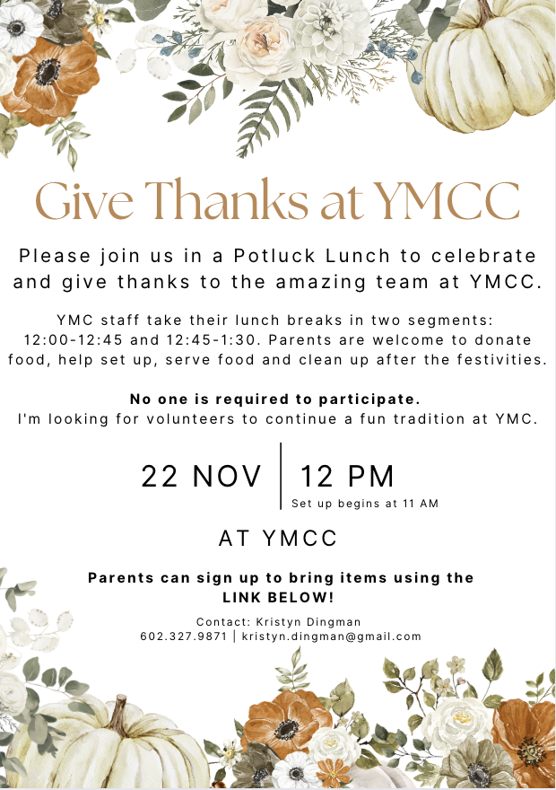
Low engagement, fragmented messaging.
The organization’s communication was scattered across mismatched flyers, inconsistent posts, and one-off graphics. Parents tuned it out, turnout and volunteering had stalled.
The goal wasn’t “make it prettier.” It was to make the PTSO feel like one credible, welcoming voice that busy parents would actually notice and trust.

A refresh the whole team could run with
Not just a logo, a small, repeatable system so volunteers could stay on-brand without a designer on call.
Unified identity
A clean logo, consistent color, and type system that read the same on a printed flyer and an Instagram story.
Template kit
Ready-to-edit templates so any volunteer could produce on-brand event graphics and newsletters in minutes.
One message
Aligned voice and messaging across every channel, so families heard a single, clear invitation to show up.


Design that moved the numbers
In a single semester, consistency turned quiet channels into a community.
The real result: design didn’t just make things look better, it made the community feel connected.
What I’d carry forward
The win here wasn’t a single beautiful asset, it was building a system non-designers could sustain. That’s the same instinct I bring to an in-house team: make the brand easy to keep consistent, and consistency compounds into trust.