Ben & Bo Advocacy
A brand, website, and set of resources that help families of children with autism navigate benefits, education, and support — founded and built from the ground up.
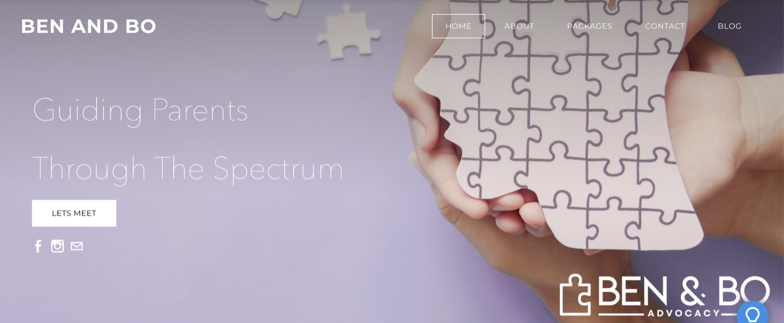
Good information nobody could use.
Parents of newly diagnosed children face a wall of dense, clinical, intimidating material at the exact moment they have the least bandwidth to absorb it. The information exists — it just isn’t usable.
Ben & Bo Advocacy — named for my two sons — needed a brand that felt like a knowledgeable friend: approachable, hopeful, and clear enough to act on when a family is overwhelmed.
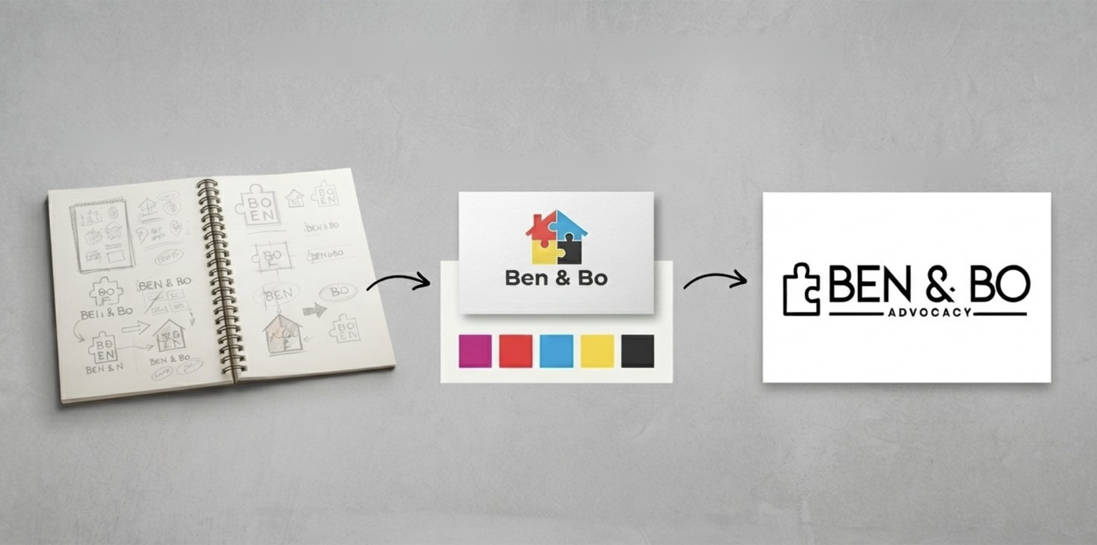
The evolution of a logo
From first sketch, through color exploration, to a warm connected-puzzle wordmark that reads as support, not deficit.
The three concepts, step by step
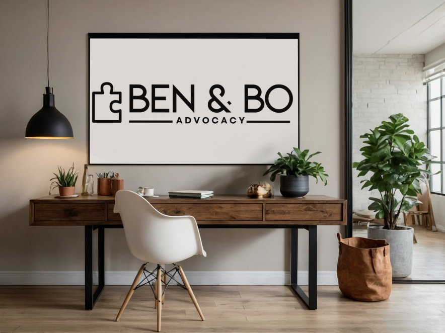
One warm, consistent system.
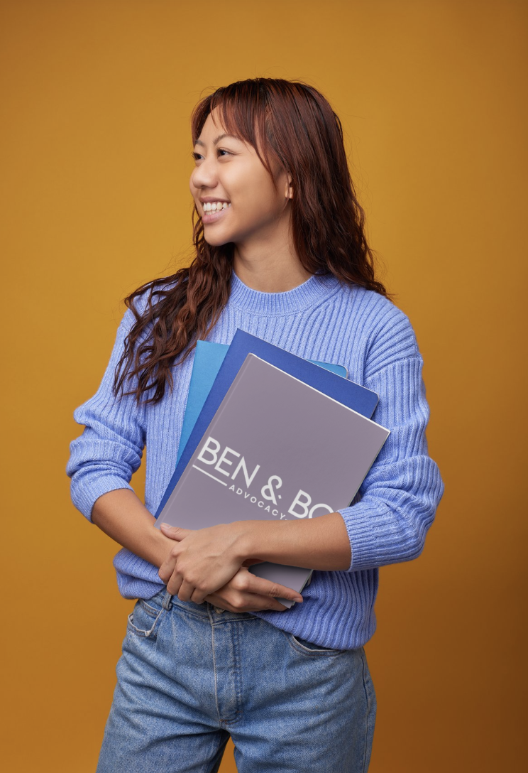
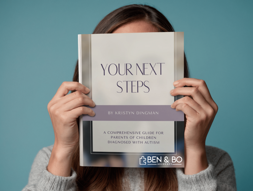
A brand carried across a website, signage, printed guides, and business cards — so every touchpoint feels like the same trusted voice.
Guidelines keep it consistent.
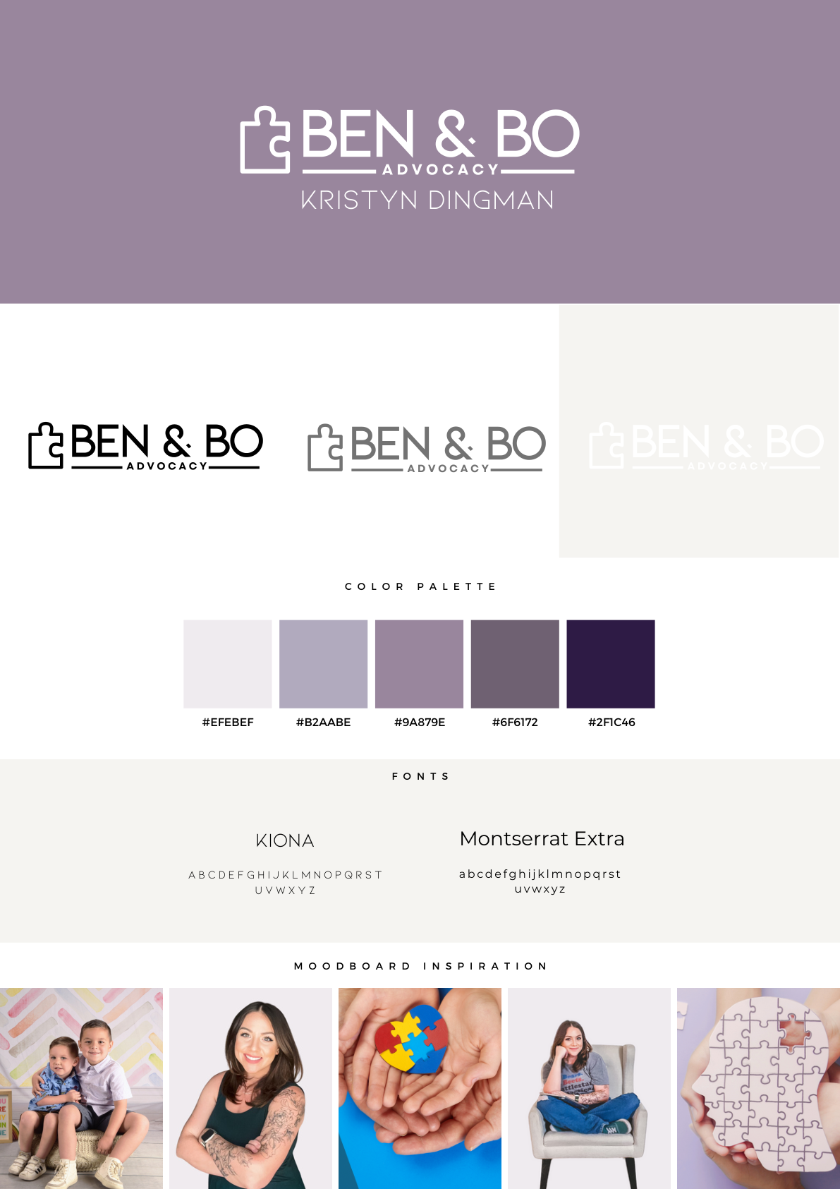
A brand is only as strong as its consistency. I documented Ben & Bo’s logo, colors, and type in a brand guideline so every guide, post, and printed piece looks and feels like the same trusted voice — no matter who’s making it.
Real support, real reach
Advocacy that translated design into families helped.
Community & consultations
Built community groups and managed one-on-one family consultations, guiding parents through benefits and educational systems.
Resources & action plans
Created client action plans, educational guides, and infographics that translate complex information into clear next steps.
Digital marketing
Social posts, email campaigns, visual blogs, and website development that grew the audience past 300 followers.
What families say
A few of the families I’ve walked alongside since 2022.
“I never would have known about all the things my kid is entitled to if it wasn’t for your help. My family is so thankful.”
“Just wanted to thank you again — I appreciate your help more than you know. You’re awesome.”
“I can’t believe how hard it is to get our kids help. I’m grateful I had someone like Kristyn guiding me through it all.”
“Thank you, Kristyn, for giving me the confidence to help my daughter. Your support has given me hope.”
“My voice is finally being heard. I feel like I have a voice after meeting with you.”
“My kids had no support. I didn’t know Arizona offered anything for kids with needs. Thanks for giving me hope again.”
“This is the best thing for parents. I felt lost, and now I feel stronger and more confident to support my family.”
“Thank you so much for your endless support throughout our journey.”
“We are so thankful for the support Kristyn provided my son. He’s able to get the help he deserves.”